這篇將繼續記錄我修改 Butterfly 主題的過程搭~
第一篇 - Butterfly配置 第二篇 - 修改CSS 第三篇 - 美化標籤 第四篇 - 插件相關 第五篇 - 自訂右鍵 今天這篇會繼續第二篇的 CSS 更改
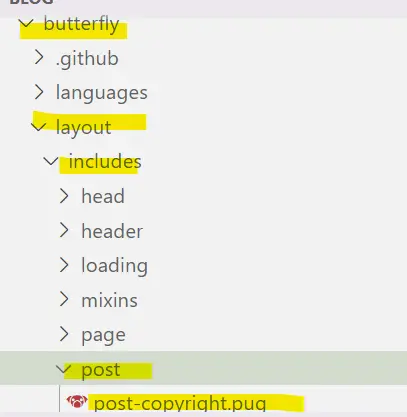
美化文章末的版權聲明 步驟1 點開以下文件 themes\butterfly\layout\includes\post\post-copyright.pug
如果你沒有修改過 post-copyright.pug 的話可以直接複製貼上以下代碼到你的post-copyright.pug裡面:
1
2
3
4
5
6
7
8
9
10
11
12
13
14
15
16
17
18
19
20
21
22
23
24
25
26
27
28
29
30
31
32
if theme.post_copyright.enable && page.copyright !== false - let author = page.copyright_author ? page.copyright_author : config.author - let url = page.copyright_url ? page.copyright_url : page.permalink - let license = page.license ? page.license : theme.post_copyright.license - let license_url = page.license_url ? page.license_url : theme.post_copyright.license_url .post-copyright .post-copyright__title span.post-copyright-info h #[=page.title] .post-copyright__type span.post-copyright-info a(href=url_for(url))= theme.post_copyright.decode ? decodeURI(url) : url .post-copyright-m .post-copyright-m-info .post-copyright-a h 作者 .post-copyright-cc-info h=author .post-copyright-c h 發布時間: .post-copyright-cc-info h=date(page.date, config.date_format) .post-copyright-u h 更新時間: .post-copyright-cc-info h=date(page.updated, config.date_format) .post-copyright-c h 文章版權 .post-copyright-cc-info a.icon(rel='noopener' target='_blank' title='Creative Commons' href='https://creativecommons.org/') i.fab.fa-creative-commons a(rel='noopener' target='_blank' title=license href=url_for(license_url))=license
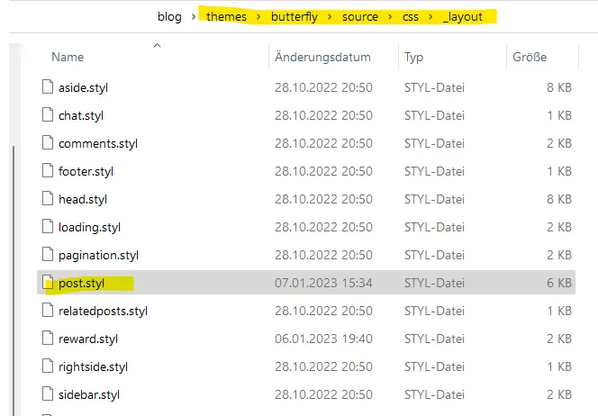
步驟2 點開以下文件 themes\butterfly\source\css\_layout\post.styl
如果你沒有修改過 post.styl 的話可以直接複製貼上以下代碼到你的post.styl裡面:
1
2
3
4
5
6
7
8
9
10
11
12
13
14
15
16
17
18
19
20
21
22
23
24
25
26
27
28
29
30
31
32
33
34
35
36
37
38
39
40
41
42
43
44
45
46
47
48
49
50
51
52
53
54
55
56
57
58
59
60
61
62
63
64
65
66
67
68
69
70
71
72
73
74
75
76
77
78
79
80
81
82
83
84
85
86
87
88
89
90
91
92
93
94
95
96
97
98
99
100
101
102
103
104
105
106
107
108
109
110
111
112
113
114
115
116
117
118
119
120
121
122
123
124
125
126
127
128
129
130
131
132
133
134
135
136
137
138
139
140
141
142
143
144
145
146
147
148
149
150
151
152
153
154
155
156
157
158
159
160
161
162
163
164
165
166
167
168
169
170
171
172
173
174
175
176
177
178
179
180
181
182
183
184
185
186
187
188
189
190
191
192
193
194
195
196
197
198
199
200
201
202
203
204
205
206
207
208
209
210
211
212
213
214
215
216
217
218
219
220
221
222
223
224
225
226
227
228
229
230
231
232
233
234
235
236
237
238
239
240
241
242
243
244
245
246
247
248
249
250
251
252
253
254
255
256
257
258
259
260
261
262
263
264
beautify() headStyle(fontsize) padding-left : unit (fontsize + 12 , 'px' ) &:before margin-left: unit ((- (fontsize + 6 )), 'px' ) font-size: unit (fontsize, 'px' ) &:hover padding-left: unit (fontsize + 18 , 'px' ) h1, h2, h3, h4, h5, h6 transition: all .2s ease-out &:before position: absolute top: calc (50% - 7px ) color: $title-prefix-icon-color content: $title-prefix-icon line-height: 1 transition: all .2s ease-out @extend .fontawesomeIcon &:hover &:before color: $light-blue h1 headStyle (20 ) h2 headStyle (18 ) h3 headStyle (16 ) h4 headStyle (14 ) h5 headStyle (12 ) h6 headStyle (12 ) ol, ul p margin: 0 0 8px li &::marker color: $light-blue font-weight: 600 font-size: 1.05em &:hover &::marker color: var (--pseudo-hover) ul > li list-style-type: circle #article-container word-wrap: break-word overflow-wrap: break-word a color: $theme-link-color &:hover text-decoration: underline img display: block margin: 0 auto 20px max-width: 100% transition: filter 375ms ease-in .2s p margin: 0 0 16px iframe margin: 0 0 20px if hexo-config ('anchor' ) a.headerlink &:after @extend .fontawesomeIcon float: right color: var (--headline-presudo) content: '\f0c1' font-size: .95em opacity: 0 transition: all .3s &:hover &:after color: var (--pseudo-hover) h1, h2, h3, h4, h5, h6 &:hover a.headerlink &:after opacity: 1 ol, ul ol, ul padding-left: 20px li margin: 4px 0 p margin: 0 0 8px if hexo-config ('beautify.enable' ) if hexo-config ('beautify.field' ) == 'site' beautify () else if hexo-config ('beautify.field' ) == 'post' &.post-content beautify () > :last-child margin-bottom: 0 !important #post .tag_share .post-meta &__tag-list display: inline-block &__tags display: inline-block margin: 8px 8px 8px 0 padding: 0 12px width: fit-content border: 1px solid $light-blue border-radius: 12px color: $light-blue font-size: .85em transition: all .2s ease-in-out &:hover background: $light-blue color: var (--white) .post_share display: inline-block float: right margin: 8px 0 width: fit-content .social-share font-size: .85em .social-share-icon margin: 0 4px width: w = 1.85em height: w font-size: 1.2em line-height: w .post-copyright position: relative margin: 40px 0 10px padding: 10px 16px border: 1px solid var (--light-grey) transition: box-shadow .3s ease-in-out overflow: hidden border-radius: 12px !important background-color: rgb (239 241 243 ) &:before background var (--heo-post-blockquote-bg) position absolute right -26px top -120px content '\f25e' font-size 200px font-family 'Font Awesome 5 Brands' opacity .2 &:hover box-shadow: 0 0 8px 0 rgba (232 , 237 , 250 , .6 ), 0 2px 4px 0 rgba (232 , 237 , 250 , .5 ) .post-copyright &-meta color: $light-blue font-weight: bold &-info padding-left: 6px a text-decoration: none word-break: break-word &:hover text-decoration: none .post-copyright-cc-info color: $theme-color; .post-outdate-notice position : relative margin: 0 0 20px padding: .5em 1.2em border-radius: 3px background-color: $noticeOutdate-bg color: $noticeOutdate-color if hexo-config ('noticeOutdate.style' ) == 'flat' padding: .5em 1em .5em 2.6em border-left: 5px solid $noticeOutdate-border &:before @extend .fontawesomeIcon position: absolute top: 50% left: .9em color: $noticeOutdate-border content: '\f071' transform: translateY (-50% ) .ads-wrap margin: 40px 0 .post-copyright-m-info .post-copyright-a, .post-copyright-c, .post-copyright-u display inline-block width fit-content padding 2px 5px [data-theme="dark" ] #post .post-copyright background-color #07080a text-shadow #bfbeb8 0 0 2px border 1px solid rgb (19 18 18 / 35% ) box-shadow 0 0 5px rgb (20 , 120 , 210 ) animation flashlight 1s linear infinite alternate .post-copyright-info color #e0e0e4 #post .post-copyright__title font-size 22px .post-copyright__notice font-size 15px .post-copyright box-shadow 2px 2px 5px
如果你有修改過的話可以單獨增加以下代碼 (新增在任何位置都可以搭) :
1
2
3
4
5
6
7
8
9
10
11
12
13
14
15
16
17
18
19
20
21
22
23
24
25
26
27
.post-copyright-cc-info color : $theme-color; .post-copyright-m-info .post-copyright-a , .post-copyright-c , .post-copyright-u display inline-block width fit-content padding 2px 5px [data-theme="dark" ] #post .post-copyright background-color #07080a text-shadow #bfbeb8 0 0 2px border 1px solid rgb(19 18 18 / 35% ) box-shadow 0 0 5px rgb(20 , 120 , 210 ) animation flashlight 1s linear infinite alternate .post-copyright-info color #e0e0e4 #post .post-copyright__title font-size 22px .post-copyright__notice font-size 15px .post-copyright box-shadow 2px 2px 5px
步驟3 自訂版權聲明 1 2 3 4 5 post_copyright: enable: true decode: true license: 你想使用的 CC 版權 license_url: 它的URL連結
CC相關資源
(Optional) 步驟4 如果某篇文章需要單獨配置 1 2 3 4 5 6 7 8 9 --- title: date: updated: copyright_author: copyright_ url: license: license_url: ---
右上角置頂文章特效 為置頂的文章加上一些小特效讓他看起來更顯眼一些 原本是為了最新文章的特效但因為最新 一直出現在置頂文章的位置所以改成置頂文章特效惹 如果你沒有置頂文章的問題就可以使用最新就好囉 先放上最後/改改後的效果:
以下是修改前的置頂文章外觀:
步驟1 開啟以下文件: themes\butterfly\layout\includes\mixins\post-ui.pug在 .recent-post-info 底下加入以下的代碼:
1 2 3 if (numberone !== 1 && is_current('/') && (!article.top || (article.new && article.top))) span.newPost 置頂 - var numberone = 1
如果你希望顯示其他文字的話可以將以上代碼中的 置頂 改成其他文字 步驟2 1 2 3 4 5 6 7 8 9 10 11 12 13 14 15 16 17 18 19 #recent-posts>.recent-post-item { position: relative; } .newPost { position: absolute; top: 0; color: rgba(255, 255, 255, 0.92); padding: 0 15px; background-color: #49b0f5b9; border-radius: 0 0 10px 10px; right: 40px; } @media screen and (max-width:600px){ .newPost { right: 0px; padding: 0 12px; border-radius: 0 10px 0px 10px; } }
刷新後就可以看到效果啦 因為老實說沒有很需要又會影響一點網站載入速度所以就拿掉的 覺得好看想要使用的小夥伴還是可以裝裝看搭 左側邊欄 如果你不知道這是什麼的話可以參考下圖 步驟1 打開以下文件 1 themes\butterfly\layout\includes\layout.pug
在最下面找到以下的代碼:
1 2 3 4 include ./rightside.pug !=partial('includes/third-party/search/index', {}, {cache: true}) !=partial('includes/right-menu/index', {}, {cache: true}) include ./additional-js.pug
1 2 3 4 5 6 7 8 9 10 11 12 .contact-info .option i.fas.你想使用的icon .bloktop .text 你想加入的內容 .strip .option i.fas.你想使用的icon .blok .text .strip 你想加入的內容
步驟2 1 2 3 4 5 6 7 8 9 10 11 12 13 14 15 16 17 18 19 20 21 22 23 24 25 26 27 28 29 30 31 32 33 34 35 36 37 38 39 40 41 42 43 44 45 46 47 48 49 50 51 52 53 54 55 56 57 58 59 60 61 62 63 64 65 66 67 68 69 70 71 72 73 74 75 76 77 78 79 80 81 82 83 84 85 86 87 88 89 90 91 92 93 94 95 96 97 98 99 100 101 102 103 104 105 106 107 108 109 110 111 112 113 114 115 116 117 118 119 120 121 122 123 124 .contact-info { position : fixed; top : 22% ; z-index : 200 ; left : -51px ; transition : 0.4s ; } .contact-info :hover { left : 0px ; } .contact-info .option { cursor : pointer; position : relative; } .contact-info .option i { display : block; width : 50px ; text-align : center; height : 60px ; line-height : 60px ; background : rgb (255 , 255 , 255 ); color : #b9b9b9 ; font-size : 20px ; transition : 0.4s ; border-radius : 0 10px 10px 0 ; } .contact-info .option :hover i { color : #3498db ; } .contact-info .text { border-radius : 15px ; position : absolute; height : 60px ; width : 200px ; background : rgba (255 ,255 ,255 ,.85 ); top : 0 ; z-index : -1 ; left : -136px ; color : rgb (0 , 0 , 0 ); line-height : 60px ; text-align : center; transition : 0.4s ; } .contact-info .option :hover .text { left : 60px ; } .contact-info .blok { position : absolute; height : 60px ; width : 100px ; top : 0 ; z-index : -1 ; left : 0px ; } .contact-info .bloktop { position : absolute; height : 75px ; width : 100px ; bottom : 0px ; z-index : -1 ; left : 0px ; } .contact-info .blokbottom { position : absolute; height : 75px ; width : 100px ; top : 0 ; z-index : -1 ; left : 0px ; } .contact-info .option :hover .blok ,.contact-info .option :hover .bloktop ,.contact-info .option :hover .blokbottom { left : 0px ; } [data-theme=dark] .contact-info .option i { background : rgb (22 , 22 , 22 ); color : #b9b9b9 ; } [data-theme=dark] .contact-info .text { background : rgba (23 , 23 , 23 , 0.85 ); color : rgba (255 , 255 , 255 , 0.92 ); } @media screen and (max-width :1300px ){ .contact-info { display : none!important ; } } .contact-info .text .strip { border-radius : 5px ; position : absolute; height : 36px ; width : 5px ; background : rgba (20 , 163 , 230 , 0.8 ); top : 12px ; z-index : -1 ; right : 4px ; transition : 0.4s ; } [data-theme=dark] .contact-info .option :hover i { color : #3498db ; } .contact-info .option .text .post-reward .tip-button__text {margin-top : 0rem ;margin : 25px !important ;} .post-reward .reward-button .reward-main .reward-all { margin-top : 0rem ; border-radius : 12px !important ;} .contact-info .option .text .post-reward .reward-button .reward-main .reward-all {z-index : 999 !important ;} [data-theme="dark" ] .contact-info .option .text .post-reward .tip-button {border : solid 2px rgba (236 , 233 , 233 , 0.8 );background : #043749d0 ;}
以上代碼不包跨播放音樂的css 因為我本人不需要所以刪掉了 需要的可以到原文找 Hexo主題Butterfly修改過程 【Butterfly 美化教學#6】
)